
Creating Building Blocks That Change How We Watch the Game
This is an adaptation of our presentation at the 2025 AVCA Convention. Slides and presentation video can be found at the bottom of this post. All data is taken from NCAA tournament semifinals and finals, 2015-2025 and the 2025 NCAA tournament regional semifinals and finals.
Where Volleyball Fandom Is and What It Needs
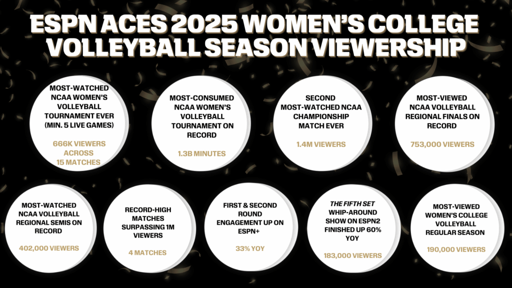
There’s been a lot of talk lately around the growth of volleyball attendance and viewership. In the last few years, women’s indoor college volleyball has done things like this…

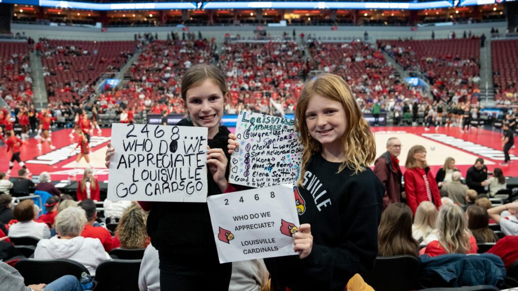
And this…
The question becomes…

Actually, the question becomes, “How do we fulfill the potential we’re showing?”
To answer that, it’s helpful to consider where all the fans are coming from. While networks talk about “casual viewers”, fulfilling volleyball’s potential will require more than just casual fans. How do fans go from casual to something more? They connect to the game and people who love it. This doesn’t mean having interesting factoids about players. It means feeling something. It means knowing something. Like this guy…

Tony Romo doesn’t just know football, he feels football, and he shares both his knowledge and his emotion when he broadcasts. When you watch a football game Romo analyzes, you notice his excitement for what’s happening and you might even notice how he points you towards where it will happen.
What’s special about how he does his job?
- He loves not just the game, but the analysis and the insight.
- He demystifies the game by connecting what we see (the context/situation) to what is about to happen.
- He increases engagement by directing fans towards where the important stuff will happen.
- He helps fans understand not just what happened tactically but why it happened.
- He understands not just how the game is played, but how it is contested.
But volleyball doesn’t need its own Tony Romo. Volleyball needs to create the framework that supports people like him as they nerd out for fan learning and enjoyment. Volleyball needs a better understanding of how volleyball is contested. Volleyball needs to give people that love and understand the sport better tools to share that love and understanding with a larger audience.
The Tools We Have
To better understand how volleyball is contested, you should first notice which tools are commonly used now to describe the game. The stats listed below are examples of tools that limit the stories that can be told about our sport.
- Attack efficiency/Hit percentage
- Assists
- Errors
- Match-level data
Attack Efficiency/Hit Percentage
How does attack efficiency limit storytelling? The same way batting average limits storytelling in baseball, where attack efficiency came from. In baseball, getting a hit is a step towards scoring a run, which is a step towards winning a game. Batting average tells you something about how good a hitter is, but it doesn’t tell you nearly enough. That’s why baseball has turned to other stats. Volleyball should do the same. Attack efficiency tells you something about a hitter, but it doesn’t make the hitter’s contributions to winning points very clear. Unlike batting average, attack efficiency subtracts points for errors, which means fans can’t use it to tell how often their favorite players are scoring.
Assists
How do assists limit storytelling? They don’t describe what a setter is actually doing to direct their team’s offense. They don’t describe how well a setter is actually setting, they’re just a stat that early statisticians took from basketball because someone setting an outside hitter looked enough like a point guard passing to a forward. But basketball assists tell you something about how special certain players are, whereas volleyball assists do not. When Nikola Jokić, a center, accounts for 1/3 of his team’s assists per game, he’s a unicorn. If a setter gets less than 1/2 of their team’s assists, their team has some serious problems. That means assists don’t describe anything useful about a setter’s performance.
Errors
How does talking about errors limit storytelling? While errors can sometimes make the difference between winning and losing, they typically aren’t what makes the difference, even when the score is close. When you watch the NCAA tournament, teams are earning three times as many points as they are giving to their opponents via unforced errors. Focusing on errors means less time spent on what actually drives winning: earned points. Further, since unforced errors occur so much less often than earned points, they should be discussed relative to earned points, rather than in isolation.
Match-level Data
How does match-level data limit storytelling? In other sports, when teams run back out of the locker room after half time, the score is the same as when they ran into the locker room. That means their efforts from one period of play to the next are cumulative. But the score keeps resetting in volleyball. If a player scores 10 points in the first set and doesn’t score another point in the rest of the match, fans are missing some important context about that player’s performance that can’t be seen if they only know that a player scored 10 points in the match. Only having match-level data makes it hard to tell stories that compare one set to another, which is often key to understanding how and why teams win.
Just Having Stats Is Not Enough
People like Tony Romo use stats to help them explain what they see happening during play. But if the stats don’t connect to what they see, then it isn’t the expert who needs to change, it’s the stats available to them. That’s why volleyball isn’t waiting for its own version of Tony Romo. Volleyball is waiting for stats that allow experts to adequately explain what they’re seeing.
The stats you’re waiting for aren’t even that fancy or advanced. That’s what makes these building blocks so useful in storytelling. They’re simple and intuitive. They can be used alone or layered into other metrics. They’re universal because they help describe the game wherever it’s played, not just by the pros.
How Volleyball Actually Works
Perhaps surprisingly, volleyball works a lot like a hurdles race. Even better, volleyball is like a series of hurdles races. A team has to win three races to 25. In hurdles, the winner doesn’t have to run the cleanest, the winner is who runs the fastest. In volleyball, the team that wins is the team that beats the other to 25, regardless of how neatly they get there. Then both teams go back to the starting line and race again and the outcome of the next race can be very different to the last one.
Unlike teams in other sports, volleyball teams can’t patiently wait for the game to be over once they have a sufficient lead. Just like in a race, if a competitor stops racing, they will be caught. Volleyball teams have to keep scoring in order to win the race to 25, just like runners have to keep running to get themselves across the finish line. Hoping your opponent will stop racing and push you across the finish line doesn’t work in hurdles. It almost never works in volleyball either.
If that’s a better way of understanding how volleyball is contested, then what kinds of stats would help experts tell better stories about volleyball matches?
The Building Blocks Volleyball Needs
- Kill percentage
- Distribution data
- Reception data
- Points
- Team scoring data
- Set-level data
Kill Percentage
Kill percentage is similar to attack efficiency but it explains more with less. It’s better at describing how often a player or team scores when attacking, it’s better for predicting outcomes and layering into more advanced stats. How is kill percentage similar to attack efficiency? Kills do most of the work in determining what a team’s or player’s attack efficiency is.
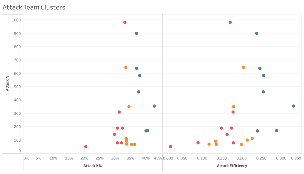
The data in the plots above show team kill percentage and attack efficiency, with teams clustered into thirds. You can see that the distribution of the teams is roughly the same in both plots. That means changing from attack efficiency to kill percentage doesn’t take any explaining. The benefit is that kill percentage has a much clearer connection to winning points, winning sets, and winning matches. When a team has a higher kill percentage than their opponents, they almost always win. Kill percentage helps fans understand what is likely to happen when a team attacks. Teams that earn kills 50% of the time will score about half the time they attack. It’s much harder to figure out how often a team that hits .250 scores, but it isn’t 25% of the time.
As that example shows, kill percentage is more intuitive than attack efficiency. It’s more intuitive because it doesn’t include errors. Remember that winning the race means getting to 25 the fastest, not the cleanest. Kill percentage helps fans understand who’s winning and why more easily than attack efficiency.
Distribution
Distribution data is much better than assist data because it tells more about setters and offenses, it connects better to attacking and passing metrics, and it creates opportunities to discuss decision making and strategy. The stories that can be told about setters using distribution are stories about how they manage their teams’ offenses and distribution gives fans insight into how setters are doing that job.
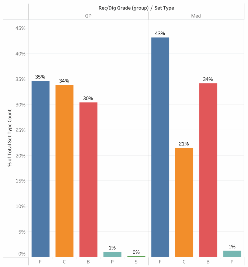
The data in the two plots above show how NCAA semifinalist and finalist setters distribute the ball to their attackers in two situations, good passes and medium passes when they have three front row attackers. It’s not necessary to understand reception grades or passing averages to understand what these plots are saying though. All a fan needs to understand is that “good” means the setter’s life is easy, they can set comfortably and “medium” means the setter’s job is a little bit tougher, they have to move a decent amount before setting.
In the semifinals and finals, setters distribute the ball fairly evenly between outside hitters (F), middles (C), and opposites (B) when things are easy. When things get a little harder, they set middles a lot less, set outsides a lot more, and set opposites a little more. That makes a lot of intuitive sense as fans watch games. That becomes a baseline and comparisons can be made between that baseline and specific teams.
As an example, here are the same two plots, showing only 2025 NCAA champions Texas A&M’s distribution. They benefitted from having All American Logan Lednicky attacking on the right, so they set her much more than most teams would set their opposites. As a result, they set their outsides much less and their middles an average amount. When things got harder, they didn’t set Lednicky much less. (You may remember how well Maddie Waak, their setter, was able to take some more challenging passes and get them to her top attacker.) Waak set Lednicky much more than most semifinalists and finalists set their opposites on medium passes.
Having this information available for discussion gives broadcasters and fans rich and interesting ways to talk about setters and offenses that current data doesn’t allow. When people want to talk about how a team’s offense runs through a certain player, distribution data is a powerful way to tell that story.
Reception Data
Contrary to expectation, the kind of reception data needed for better storytelling isn’t reception averages, at least not in the near future. Gathering that kind of data would be much more difficult because it would require many more people with specialized knowledge of the game and it would require universally accepted standards for receptions. Both of these things are highly unlikely to happen any time soon, but that doesn’t mean there aren’t stories to be told about passing.
Just having information about how often each player passes would be a great start. That information would facilitate stories around serving strategies as well as more nuanced discussions of the “serve-pass battle” that often comes up. Who teams are serving is an important part of that battle, but there’s no data available to support those discussions.
To give an example of how that simple data can be layered onto other data to tell better stories, consider one aspect of how Louisville and Texas A&M served at each other in their regional semifinal.
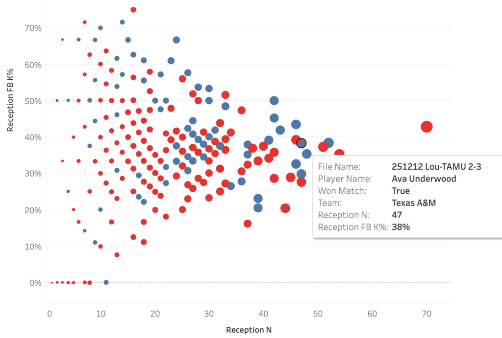
These two plots show the same data, the only difference is which data point is highlighted. The plots show how well a team attacked in a match when a particular player passed compared to how often that player passed, so each dot is a single player in a single match. The two highlighted players are liberos, Ava Underwood of Texas A&M and Kamden Schrand of Louisville, and the boxes show their performances in their match against each other. Louisville served at Underwood 47 times in the match and Texas A&M earned a first ball kill 38% of the time when she passed. Contrast that with how A&M served at Schrand: she passed only 27 serves, probably because her team earned a first ball kill on 52% of her passes.
There’s a story to be told there about why each team chose their serving targets but that story can only be told if people have access to reception counts. The story gains depth from the addition of kill percentage. Using this data, it becomes possible to not only talk about serving strategies but it also becomes possible to have stories to tell about liberos and other ball control players.
Points
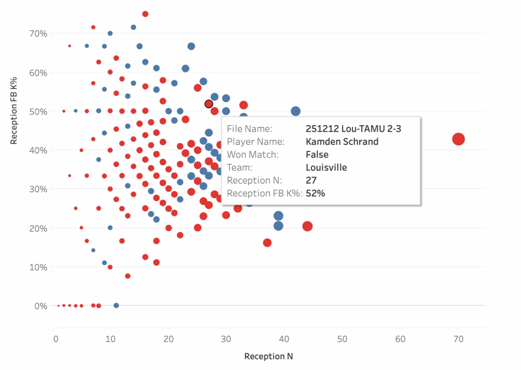
As mentioned previously, when elite teams play, points are earned much more often than errors are conceded. For this reason, broadcasters and fans should be exposed to earned points (kills, blocks, and aces) much more than they should be exposed to errors. There’s so much more to talk about.
The box plots above are separated in two ways. First, they are split into earned points (pair on the left) and unforced errors (pair on the right). Then, they are split into when teams won sets (left side of each pair) and when teams lost sets (right side of each pair). What you see is that, on average, set-winning teams earn about 19 points and commit about 5 unforced errors. On average, set-losing teams earn about 15 points and commit about 5 unforced errors. The difference between winning and losing is more often in the number of points each team earns rather than in the errors they commit.
But to tell stories about points, information about points needs to be made clearly available. While this is the case internationally, it is not the case in the U.S.. NCAA box scores typically do not display points as a single number and, if they do, the way blocks are counted can make the number unreliable. If earned points and unforced errors were displayed consistently and in one place, people could easily relate those numbers to the race to 25 points as they watch a match.
Kills and Errors: an Example
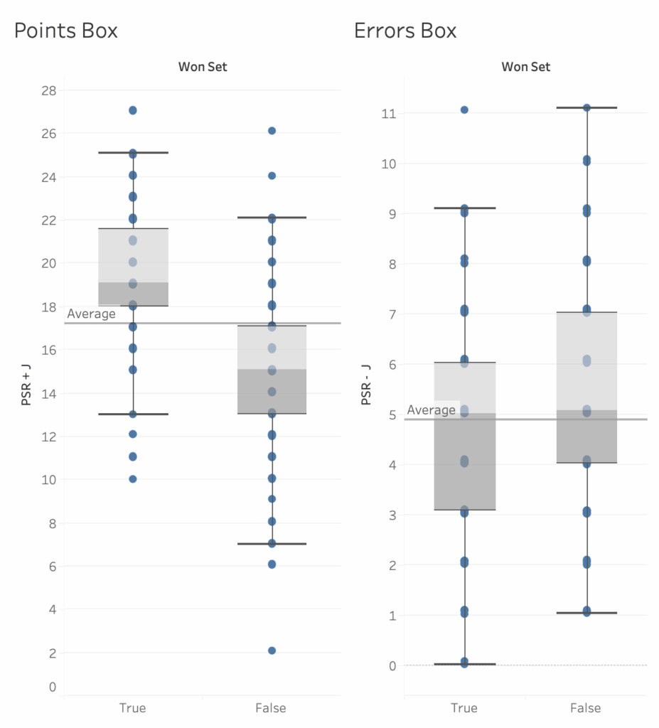
In the 2025 NCAA regional semifinals and finals, Texas first beat Indiana and then lost to Wisconsin. In the graph above, the two leftmost bars show Indiana’s kills and attack errors as well as Texas’. The two rightmost bars show the same information for Texas, followed by Wisconsin. In the match against Indiana, Texas made fewer unforced attack errors than Indiana but also earned fewer points than they did. Indiana had more of each, but in equal amounts, so both teams were equal in points won and lost via attacking. This means the match was decided by other factors. In this match, Texas had 12 blocks while Indiana had 3. Two nights later, Texas committed nearly the same number of unforced errors and had slightly more kills against Wisconsin than against Indiana. While Wisconsin committed quite a few unforced attack errors, they more than made up for that by having more kills than Texas by a wide margin. Being able to see how and how much teams are earning points is a powerful part of telling stories about how and why teams win.
Team Scoring: Side Out and Point Scoring
Team scoring data is another building block that helps people understand how the race to 25 progresses. This data has been made more available by NCAA teams in recent years but, because it is still not universal, it is rarely used by fans and broadcasters to explain how matches unfold. But side out percentage and point scoring percentage are simple, powerful pieces of data that can help tell stories about who’s winning, who’s losing, and why.
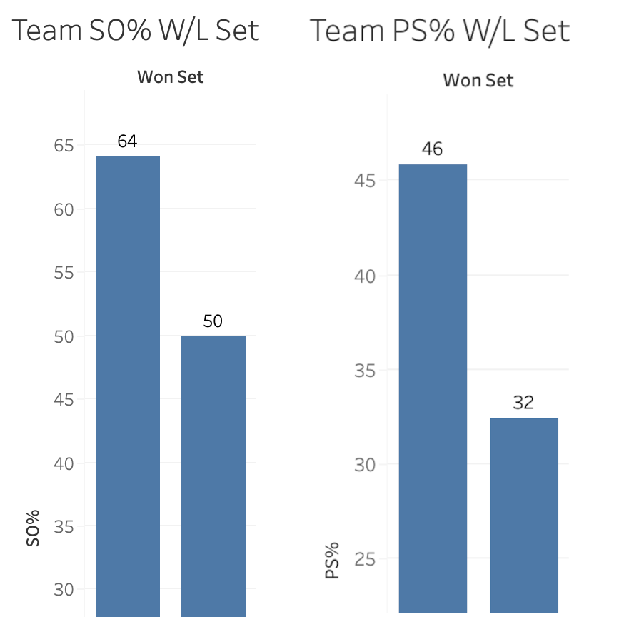
In the graphs above, the left pair show side out percentage while the right pair show point score percentage. Within each pair, the bar on the left shows the percentage when teams win sets, while the bar on the right shows the percentage when teams lose sets. The differences are clear. If a team wants to win the race to 25, they need to side out at better than 60% while point scoring at over 40%. To frame it in a slightly different way, If a team can side out at over 60% while holding their opponent to under 55% side out, they will win the race to 25.
As with the previous building blocks, team scoring data is intuitive and powerful. Does a team side out on their first or second try for an entire set? They’re probably winning. If they get stuck in serve receive at some point in a set, do they make up for it at some point with how they are serving? These are stories that become possible to follow when team scoring data is made available.
Set-level Data
The point was made earlier that winning matches in volleyball requires a team to win three races to 25 before their opponent does. Match-level data obscures how each race is progressing and makes it more difficult for people to understand how the score of the current set came to be. Only data separated by set can give that information.
This data is generally available in an NCAA box score, but only for a very limited amount of data. Typically, people can see set-level data for teams but not for individuals. While that makes some set-level storytelling possible, it’s difficult to explain how individual players are contributing to their team on a set-by-set basis.
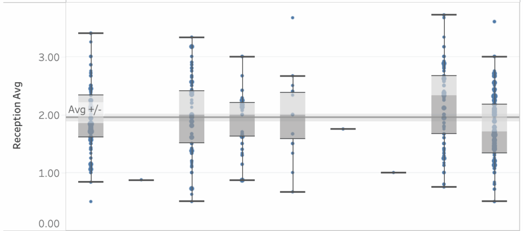
Set-level data is a powerful tool that helps explain how match-level data comes to be. The box plots above represent average players’ performances but each blue dot shows a measure of single-set performance. The sum of the blue dots yields the average, which can look very different than what happens in a single set. Having the comparison between set-level data and match-level data makes it possible to tell much more nuanced stories about performance.
Each of the building blocks listed above becomes more useful when available by set as well as for an entire match. Rather than struggling to figure out for themselves why a player or team is losing a set, despite good match averages, people can refer to how that player or team is doing in the current set and compare that information to how they did in other sets. They will be able to see how strategies such as distribution and serve targeting change on a set-by-set basis.
Looking Ahead
When stats are available that better reflect how volleyball is contested, those stats are much more easily incorporated into commentary, television graphics, and everyday volleyball talk. This helps connect more people to the game because, as Tony Romo illustrates, volleyball people can point others to what’s going to happen and where it’s going to happen. Broadcasters can set up more interesting pre-match discussions about how teams compare and what to expect when they compete.
When volleyball people have access to building blocks that connect better to the game they’re watching and talking about, they are able to make richer comparisons to other sports. A volleyball setter isn’t just like a football quarterback because they both take the ball and give it to other people. A setter is like a quarterback because they make reads of situations and make offensive adjustments to exploit what they see. A setter can “check down” to a different offensive option as their team’s reception forces them to move off the net. When the number of kills two teams earn don’t differentiate them from one another (like Texas against Indiana above), earning points in other areas of the game help explain the score difference. It’s like when football people talk about teams “relying on special teams” to win a game.
If we start using the building blocks described here, we create the foundation for the next evolution. These are relatively small steps, things that can be done without too much change to systems already in place. Think of how much better broadcasts will be when everyone has access to rotation-level data, heat maps, and advanced analytics. But we can’t get to the next evolution without starting this evolution first.
The video below was recorded on an iPad in the room, so the audio isn’t the greatest, but you should be able to hear everything.
Here are the slides used: https://drive.google.com/file/d/14nM2HtON9FIH2o49pbuqwHQbyyk8HYm0/view?usp=drive_link